[Stories of Place – technical | creative storytelling workshop: 2017]
*
Level Zero
Pallanza Bay, Italy. 2010. This is where this not-quite-a-detour-and-more-like-a-redirecting started: how do we work well as teams with people who aren’t trained in or maybe even focused on science? [This place – Pallanza Bay – also happens to be where Alessandro Volta discovered methane in the reed beds way back in the 1770s and where plumbing still goes whang-o now and again when his discovery bubbles up in the wrong places]. I was there for a chlor-alkali site characterization and the question of who did what when and how that might make different parties more or less liable in the apportioning of remediation costs. There were many parts of that site characterization that were interesting, but what caught my attention up there along the shoreline was this: The Museum of the Art of Hat-Making. Yeah. Mercury. And hat making. Which means there is the seed of a story there and that story contains, at least in a literary sense, a rabbit hole. And, literary or no (or yes), I am a product of where I was raised and an Alice (for what that’s worth and with great love for the grandmothers from whom I was given that magical middle name), which means this story’s gotta start with that run what you brung – meaning, with that what you know and then build from there.
Level One
Over the span of its operation, a typical mercury cell chlor-alkali facility would have released somewhere in the neighborhood of 10 tons of elemental mercury into the aquatic environment. There are (or were) an unknown number of these facilities around the world, but a reasonable estimate is 200 and includes locations everywhere: in the U.S., in Canada, in Latin America, in China and Southeast Asia, in many of the countries of the European Union and the former Eastern Bloc. To this day, nobody really knows how many the Soviets built. Or where. They were built on rivers, lakes, fjords, in estuaries, in lagoons, and on harbors; by 2017 a slowly increasing majority have been abandoned, closed or converted to other technologies. The process itself begins with NaCl brine and ends with caustic soda and chlorine. Both caustic soda and chlorine have many uses; the chlorine, as example, to make pesticides, bleach for the pulp and paper industry, and PVC, and caustic soda a necessary ingredient for color-fast dying of synthetic fibers and a catalytic cracking agent for turning crude oil into gasoline and other petroleum refinery products.
In the period from roughly the middle of the 20th century until its end, chlor-alkali production relied globally on mercury and electricity to split that Na from the Cl. This process wasn’t a closed loop and elemental mercury was relatively cheap: if the process was run efficiently, production might release ~10 lbs of mercury into wastewater a year. Depending on when you were on that 20th century arc, that wastewater could have been discharged into the river, lake, fjord, estuary, lagoon, or harbor. Or it could have been discharged into a treatment pond. Depending on when you were on that 20th century arc, the bottom of that pond might have been sealed with fine clay or a membrane liner. If the process was run inefficiently – although not necessarily in violation of any discharge regulations and as appeared to have happened in many locations in the initial years of facility operation – then over the life of the facility, production of chlor-alkali likely released somewhere in the neighborhood of 10 tons of elemental mercury into the aquatic environment.
By volume, this much elemental mercury would overflow 3 × 55 gallon drums. Maybe this seems like a lot of mercury and maybe it doesn’t. The spectrum of ecological and human health impacts that result from this overflow depends on a long list of factors. Fundamentally, the type of ecosystem that that mercury was released into matters significantly. Even more fundamentally, the extent to which people living in the vicinity of that release have had to rely on that aquatic ecosystem for food and livelihood matters even more significantly. Critically, it is the type of environment – the river, lake, fjord, estuary, lagoon or harbor – that determines how far from the facility you have to be living for ‘in the vicinity’ to not include your community.
Level Two
Energy baseball.
Think of a chlor-alkali cell like you might very generally think of a car battery. But in reverse.
In a typical car battery, there are plates and there is fluid. The plates are made of lead and are stacked or slotted into cells. In each cell, the plates alternate: solid lead (Pbs) and lead dioxide (PbO2). In a typical lead-acid battery, the fluid that circulates within and between these cells is sulfuric acid (H2SO4). Batteries work like a criss-cross game of baseball: pitchers and catchers and every time the ball is thrown energy changes hands. At the beginning of the game – in a fully charged battery – the plates alternate in cells and are different: solid lead and lead dioxide and the fluid is sulfuric acid. At the end of the game – in a fully discharged battery – the plates in each cell are the same: lead sulfate (PbSO4) – and the fluid is essentially water (H2O). Pitchers and catchers and the ball is made of electrons: to move the world, the ball goes pitcher to catcher and energy is made. Recharging the battery – the catcher there in their crouch throwing balls back to the pitcher – converting those plates from lead sulfate back to solid lead and lead dioxide and that fluid back from water to sulfuric energy – costs energy.
In a battery – in baseball – the goal is the game: pitchers to catchers and with the energy you generate maybe your team wins. In a chlor-alkali cell, the process is somewhat akin to recharging the battery: apply energy in the form of electricity to the plates and it’s the fluid between them you’re focused on. In chlor-alkali baseball, the pitcher (the solid lead plate in your car battery) is made of titanium or of graphite; the catcher (the lead dioxide plate in your car battery) is a thin film of mercury flowing over steel. The fluid that fills the space between them is a brine 5-10× as salty as seawater (NaCl + H2O).There are several steps in this process, but, overall, the chemistry looks like this:

This reaction costs energy (there on the left hand side of the equation) but what it generates – caustic soda (NaOH) and chlorine (Cl2) there on the right – has value. Pitchers to catchers. Catchers to pitchers. Energy baseball.
Level Three
Five graphs. Six curves. Or maybe 7, depending on how you arrange them. They don’t tell you how to solve the problem, but they show you where the problem might be. And why.
Start by making a graph – draw a horizontal line and a vertical line; let these lines intersect at the left end of the horizontal and bottom end of the vertical. The horizontal is the x-axis – this is what is called the ‘independent variable’ axis – what you put on the x-axis drives the relationship you’re looking at. The y-axis is the ‘dependent variable’ axis- what you put on the y-axis is what you think might be changing in response to how what you’ve put on the horizontal line changes. One line is an axis. Two lines intersecting are axes. These two lines that you’ve drawn are the axes of a graph. The idea you are testing in your graph is whether the ‘x’ that you’ve chosen drives the ‘y’ that you think is a reasonable process or variable or change to have been created in response. In general, for graphs of the sorts coming below, the smallest values of whatever variable you’re looking at: the lowest concentration, the slowest rate, the shortest time, the shallowest depth lie closest to the intersection of the axes. For either axis and whatever variable, the values in question increase moving away from that intersection. Unless specified otherwise, it is reasonable to assume that the values of x and y (written {x,y}) at the intersection of the axes are {0,0}.
When you look at a graph, you are paying attention to both axes: change and response; change and response. If you can generate enough relevant data points for the relationship you are interested in, you can draw a line of some shape through these points. A line is a curve without a bend. If your data arrange themselves in a line you have a relationship that trucks out predictably toward infinity in however way you choose to define the boundaries of infinity. A curve is a line that bends in response to some force or factor that alters the predictability of the change and response: There is a dam on a stream; there is tree that they’ve paved the road around; there are only so many parking spaces in the parking lot and at some point they are full regardless of how many people continue to want to come shopping. Sometimes you can see the obstruction that bent your line into a curve; sometimes you can’t see the obstruction but you can measure its impact; sometimes in the data you can simply sense that the obstruction is there. To help explain a graph to yourself – to explain what the relationship in the data might be telling you, the first thing you can do is to try to make three statements – tell three stories – about what you see in the data you’re observing.
Graph 1 / Curve 1: Landscape-scale control on methyl mercury production
Why is this important to know? Because for methyl mercury to be made in the landscape, inorganic mercury has to be present. If there is a general relationship between the amount of inorganic mercury that is present and either the amount of methyl mercury that is made OR the speed at which it is made, it would be good to know these things.
Make a graph:
The x-axis variable (the independent variable) = the concentration of inorganic mercury present in the sediment or soil
The y-axis variable (the dependent variable) = the concentration of methyl mercury present in that same sample of dirt
Take these data from 1400+ inorganic mercury/methyl mercury data pairs from sites all over the world and plot them on one graph and what you see is this: the relationship 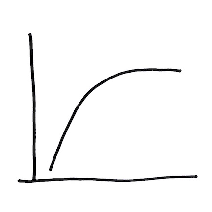 between these two variables is roughly a straight diagonal line up to about 10 milligrams per kilogram (mg/kg) or parts per million (ppm) inorganic mercury. Above this concentration of inorganic mercury on the x-axis, the data curve becomes a flat horizontal line.
To help explain a graph to yourself – to explain what the relationship in the data might be showing you, the first thing you can do is to make three statements – three stories – about what you see. In this graph, these stories could be:
- At a concentration of less than 10 ppm inorganic mercury, as the concentration of inorganic mercury increases, the concentration of methyl mercury increases too. The relationship is a diagonal line so if we know what the concentration of inorganic mercury is, we can predict what the concentration of methyl mercury is likely to be.
- At a concentration of 10 ppm inorganic mercury or higher, even as the concentration of inorganic mercury continues to increase, the concentration of methyl mercury does not change.
- If it is bacteria (which it is – more about this later in a different graph with a different set of curves) that turn inorganic mercury into methyl mercury, is there something happening above 10 ppm inorganic mercury that is affecting the bacteria?
Even if you can’t see an obstruction, sometimes you can sense that it’s there.
Why is the information in this graph worth knowing? If you are thinking about how to clean up a location where total mercury in sediment is around 10 ppm or lower, the relationship in this graph suggests that IF you can decrease the concentration of inorganic mercury in surface sediment (for example, by dredging it out or putting a stable cap of clean material over it), THEN you will decrease the concentration of methyl mercury. IF you are decreasing the concentration of methyl mercury THEN you are also very likely decreasing the speed at which bacteria are changing inorganic mercury into methyl mercury. This decrease in the speed of methyl mercury production has meaning for ecological recovery.
IF, however, you are thinking about how to clean up a site where total mercury in sediment is 10 ppm or higher, the relationship in this graph suggests that you could significantly clean up the mercury that’s there (say, decreasing an average concentration from 100 ppm to 10 ppm) and that clean up might have little to no impact on the methyl mercury question. That clean up might still have significant value for other reasons: keeping high concentrations of mercury from eroding and being transported into other areas like wetlands is important (more about that later in a different graph with a different set of curves) – but if the goal of the clean up is to protect the local food web from methyl mercury exposure, a high concentration sediment clean up might result in little change to what you see in fish tissue in the general area of the clean-up site. What this statement implies is important: the concentration of total mercury in sediment is not always a good indicator of the extent to which the food web is at risk. The concentration of total mercury in sediment is easy to measure though, and if you have a small(-ish) budget or a large(-ish) site or complications like very deep water in which you are sampling (or some combination of all three challenges), measures of total mercury in sediment may be the best or most cost effective or most widely distributed set of data you have to work with. So you work with what you’ve got.
Overall, then, it is possible to say that in thinking about what you intend to accomplish at your site, it is good to know (1) where your site might lie on this graph in terms of the concentrations of mercury present; and (2) what a reasonable definition of ‘success’ could be for everybody associated with or impacted by the site.
Graph 2 / Curve 2: Landscape-scale control on methyl mercury transport
Why is this important to know? Because if there is mercury present in the landscape and bacteria have enough of what they need to convert inorganic mercury to methyl mercury, then your landscape may need monitoring to understand whether the food web is at risk.
Make a graph:
the x-axis variable = the percentage of your landscape that is wetlands
the y-axis variable = the strength of the relationship between dissolved organic carbon and dissolved methyl mercury in surface water.
 The relationship between these two variables is roughly a straight diagonal line: What you can do with graphs to help explain them to yourself is to make three stories from what you see. In this graph, these stories could be:
- The higher the percentage of wetlands in your landscape, the stronger the relationship between dissolved organic carbon and dissolved methyl mercury in water in your landscape.
- If your landscape has a low percentage of wetlands, the relationship between the amount of carbon in the water and the amount of methyl mercury in the water won’t be very strong; in this case, knowing something about one thing (carbon transport) won’t tell you much about a second thing (methyl mercury transport).
- If your landscape has a high percentage of wetlands, the relationship between the amount of carbon in water and the amount of methyl mercury in water may be strong enough that you can predict something about one thing (the concentration of methyl mercury in water) from a second thing (the concentration of carbon in water).
Why is this information worth knowing? Because dissolved organic carbon can be inexpensive and simple to monitor; dissolved methyl mercury is neither. IF it is possible to monitor dissolved organic carbon as a ‘stand in’ for methyl mercury and IF you have a landscape rich in wetlands, THEN you can likely generate the kind of data that let you ask useful questions: do concentrations change in response to water temperature? or the amount of oxygen in the water? do they change in response to season? to flood patterns? to tidal cycles? If you have some understanding of the why they change, you can start thinking about solutions in terms of the how to make them change differently.
Another way to say this same thing is that with the particular linear relationship in Graph 2: (1) you have an overview of whether there might be a problem with food web transfer of methyl mercury in your landscape (i.e., is there mercury present [and where is your site on the x-axis of Graph 1?] and what is your rough percentage of wetlands?) and, subsequently, (2) if you do have a problem, you might have a relatively inexpensive way to generate a data set to assess whether you can possibly move the needle on either how fast or how much methyl mercury is being made in that landscape and how it is moving through that wetland. These are the types of questions that are useful for understanding what influences biological exposure and uptake of methyl mercury in the environment.
Graph 3 / Curves 3 & 4: Fine-scale/small-scale control of methyl mercury production/loss
Why is this information worth knowing? This is the crux of the process that results in methyl mercury accumulation in food webs. This is centimeter-scale control and this graph is drawn slightly differently. In this case, when you draw your lines, let them intersect at the left end of the horizontal and top end of the vertical. On your first pass through this graph, let the processes hang in space. Once the processes make sense, they can be anchored in different environments in different ways.
Make a graph:
The x-axis variable = the rate at which bacteria are either making or taking apart methyl mercury.
The y-axis variable = depth.
Depth is generally considered the ‘z-axis’ and can be thought of in sediment or in the water column; when depth is in sediment, z = 0 is called the ‘sediment-water interface’. When depth is in the water column, z = 0 can be the actual water surface or it can be an surface within the water where something is varying above and below that interface. An example could be salt content in the water of an estuary: the fresh water flowing out of the estuary from the river has a low salt content while the salt water flowing into the estuary from the ocean has a higher salt content. These two types of water may not mix as they flow past each other in opposite directions and may create a moving interface with its own z = 0. Or a lake in which a combination of depth, stillness and temperature result in the lower portion of the lake water not mixing well with the water closer to the lake surface.
 Data for this graph are two curves:
- The curve with the bend is the rate at which methyl mercury is made
- The curve without the bend is the rate at which methyl mercury is taken apart.
Both curves are driven by bacteria and not all bacteria work in the same ways. Tell yourself three stories from the overlap of these two curves:
- At some shallow depth near the top of the graph, the rate at which methyl mercury is taken apart (straight line) is faster than the rate at which it is made (curved line).
- At some intermediate depth in the middle of the graph, the rate at which methyl mercury is made is faster than the rate at which it is taken apart.
- At some deeper depth near the bottom of the graph, the rate at which methyl mercury is taken apart is again faster than the rate at which it is made.
One idea that these three stories suggest is this: there are many kinds of bacteria that can take methyl mercury apart and they are found at all depths in sediment. There are, however, only a few kinds of bacteria that can make methyl mercury and they are most active in a narrow band of sediment depth. It is this narrow band in which making is greater than taking apart that creates the biggest ecological problems associated with mercury.
The implication of this graph that is important to consider is that the critical depth at which production exceeds consumption – the depth at which the making is faster than the taking apart – is controlled by the environment. In a flowing river without much algae and the water rich in oxygen, this critical depth might occur 12 inches deep in sediment. In a wetland, with some bacteria and plant and animal life and water that moves slowly but fast enough to keep some oxygen in circulation, this critical depth might occur within the top 1 inch of the sediment. In a salt marsh with a lot of bacteria and plant and animal life and water that may stand in stagnant ponds until all the oxygen in the pond water is gone, this critical depth might rise right out of the sediment and into the water column itself.
In thinking about mercury being released from sediment into overlying water, the sediment-water interface (that z = 0 for sediment) can function like a trap-door or a lid: in the sediment of flowing rivers, when that lid opens, what can be released into the water is inorganic mercury – the methylation that occurred deeper in the sediment having been ‘undone’ near the sediment surface. In the wetland, when the lid opens and the critical depth is 1 inch deep or shallower, what is released into the water is likely methyl mercury. In the salt marsh – and in particular in those places on the marsh where there are pools or pannes of standing water – the lid is simply propped open. If you are a small fish, whether you are in the freshwater lake, the wetland or the salt marsh can significantly influence how much methyl mercury you are exposed to. If you are a larger fish, what the food web looks like around that small fish can significantly influence the rate and extent to which you are exposed to methyl mercury from eating that small fish. If you are a person who eats the larger fish, you are also in that food web and the overall exposure passes on to you.
Why is this information useful to know? Because it is helpful to think about the overlap of these “make and take apart” curves in a location you’re assessing for remedy and, specifically: (1) what is the ‘z’ at which the making outstrips the taking apart; and (2) where is that ‘z’ relative to the sediment-water interface in this location? There are many ways to solve problems and sometimes the solution isn’t what you initially thought it might be. Sometimes the problem you’ve identified doesn’t even need solving.
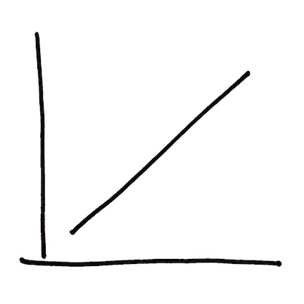
Graph 4 / Curve 5: Waterbody scale – fish exposure (rivers more than lakes)
This one isn’t always true, but the implications of the problem become clear when you read the graph backwards. Or when you flip it upside down.
Make a graph:
The x-axis variable = the concentration of total mercury in stream water.
The y-axis variable = the concentration of total mercury in fish swimming in that stream.
The shape of the graph is the shape of the problem. 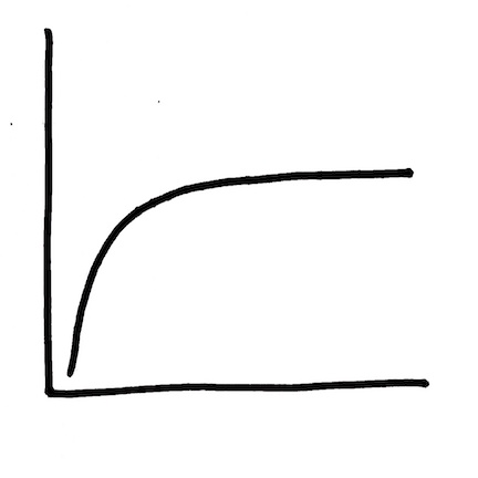 Tell yourself three stories from the data:
- At a very low concentration of total mercury in streams, it is possible to find a large range of total mercury concentrations in the fish swimming in that stream.
- At a wide range of concentrations of total mercury in streams, it is possible to find little or no change in the concentration of mercury in fish swimming in that stream.
- If you have a high concentration of total mercury in a stream, that concentration could be reduced by a significant amount without seeing any measurable impact on the concentration of total mercury in the fish swimming in that stream.
In telling yourself that third story, you have introduced a concept of time. Flip the graph upside down and think about what might be (or might have been) driving the change in the x-axis variable. 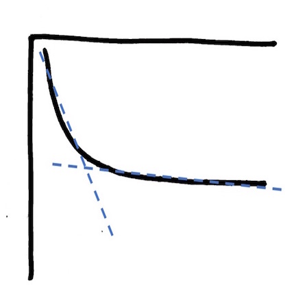 IF the concentration of total mercury in water had been declining over time because a facility had been decreasing the amount of mercury that they were releasing and then effectively stopped that release, this shape that looks like a curve might well be two straight lines: one (dotted blue here and mostly vertical) reflecting the decrease in fish exposure as the pipe is slowly being capped and a second (dotted blue and mostly horizontal) reflecting ongoing lower dose exposure from the creation and transport processes sketched out in Graphs 1-3. The second line in this flipped graph – the one that may appear almost horizontal – is the long tail of the hoped for ecological recovery from historical mercury releases into the environment.
Another way to present this same scenario in a way that also matches what you see in field data might look like this:
Graph 5 / Curves 6 & 7 – Landscape and site scale – the time disconnect in recovery
Make a graph:
The x-axis variable = time
The y-axis variable = the concentration of total mercury
Data for this graph are two curves: 
- The curve that starts high and arcs downward is the concentration of mercury in river water during and after the process of a facility closure.
- The curve that starts low and rises slowly is the concentration of mercury in fish within that landscape after the process of facility closure.
The reason for the slow rise over time in fish tissue mercury even while overall mercury exposure is going down is Graph 3: methyl mercury production in the environment. While the majority of the historical release has likely found its way into riverbank soil and sediment where it is mostly buried from all but the most significant erosion and not particularly interacting with the environment, the processes in Graph 3 continue to make methyl mercury and that methyl mercury continues to diffuse up and out of the sediment trap door. That methyl mercury diffuses into the algae who are eaten by the tiny creatures who are eaten by the smaller fish who are eaten by the larger fish and on up. This is the crux of the challenge with mercury-impacted sediment sites: where you are in space and time and ecosystem type matter. It is the relative balance of the processes described in these 5 graphs that determine how far from a historical release you have to be living for that release to not be currently – and continuously – impacting your community.
Level Four
And here, maybe, we have to go all the way back to the source for some understanding of context. And so this part begins with a question:
How do you tell the story of something that is no longer there?
Maybe you start with this: It’s a bit less than 5 hours by train from Cadiz to Madrid. There are thirteen trains per day, most days of the year, and you’re on board and you’re thinking about work. Or the weekend. Or the trip you’ve just finished. Or the vacation time you’re about to begin. And ~ 400 km from Cadiz – at a crossing where you might not even see the sign – you’ll pass within 60 km of the Almaden mine. And the name might ring a bell or it might not – we all stare idly out the same window and notice different things – but the train has just passed within 60 km of the single largest deposit of mercury in the world. A deposit that – until mining ceased in 2004 – was in continuous operation for ~ 2000 years and in that time yielded approximately 1/3 of the world’s total mercury ore.
This one location.
And nobody really understands it – the distribution of that element. The geologists don’t understand it. The engineers don’t understand it. Why do elements concentrate like they do? In this case, in Spain. Slovenia. Italy. Peru. California. Why is the mercury where it is? And the question is the same for all these deposits – from the smallest there in Italy to the largest of them all – that first location there in Spain – that one called Almaden. At Almaden, the ore body is so rich in cinnabar that elemental mercury – the mercury in thermometers – sweats from the veins in the rock walls.
If you’re a scientist or an engineer and you’re thinking about mercury in the environment you’re thinking of numbers like this: in terms of concentration, mercury is somewhere around 1/20 of a part per million (ppm) as a “global average background” in soil. As it moves around the globe – in mining waste, in air, in water – that concentration enriches and it increases: it is around 1/10 of a part per million in soil on the otherwise uncontaminated downwind edge of a continent where everything carried on wind currents – in this case, specifically the mercury found in coal – ends up eventually sifting down and depositing; it is up to one part per million in that coal itself; it is up to 10 parts per million in contaminated sediment – maybe downstream of a facility that used elemental mercury in those room-sized, not-quite batteries to make bleach or PVC or DDT – downstream where the momentum of the river changes and whatever is in suspension settles to the bottom and is stored; and it is maybe 100 parts per million or higher in the soil in places where mercury is still mined and where environmental controls might not be what they are elsewhere on the planet.
These numbers are context. In the Almaden Mine, the mercury concentration in the ore body reaches 8%. That is, within the rock itself, the concentration of mercury reaches 80,000 parts per million. Working in this environment was – and remains – very hard on the miners.
When mining at Almaden began in earnest in the 1500s – after the discovery of silver in the Americas and the realization that – with the newly invented patio process – access to mercury meant access to silver – the Spanish Crown gave convicts a choice: the galleys or the mine. It is estimated that during the period in which the mines were worked principally by convicts, ~ 25% of those convicts died during their term of labor, mostly and most likely from mercury exposure. An unknown percentage of convicts were released from their term of labor insane. Later, the work force also included slaves and the Romany, arrested, in their case, for anything and everything including the crime of speaking Romani. For slaves and for the Roma, the terms of their sentence were indefinite: for slaves, because they’d been purchased outright; for the Roma because for their term of sentence to end, the Crown required that they prove evidence of a settled home to return to. And they – the Roma – by confluence of culture, vocation and social caste, could never fulfill this criterion for legal release. For these individuals, working the mine at Almaden was a life sentence.
And you can’t really talk about the metal without also talking about the mineral: cinnabar. Or more correctly, the minerals: cinnabar and metacinnabar. The red and the black. Or in the scheme of the philosophers and the alchemists, the light and the heavy. Even more correctly (though with no greater clarity), there are actually three forms of the mineral: cinnabar, metacinnabar and hypercinnabar. The red and the black and the other black. The transition between these minerals – if it can be thought of as a transition – if one form can actually change into the next – is still a conundrum. Temperature seems important: heat metacinnabar to > 400 C and it can be transformed to cinnabar; continue heating to > 500 C and hypercinnabar may appear. That you can create these transitions in the laboratory does not mean they occur in nature though. And while it is generally agreed that the three forms of HgS are distinct minerals with distinct crystal shapes, what happens outside of the laboratory when high temperature magmas cool and minerals begin to precipitate is anyone’s guess.
In all cases though, the mineral is HgS. And cinnabar – the red form – has been used by people for over 10,000 years as a pigment. That pigment – vermillion – has appeared throughout the world’s history in cosmetics, lacquers, wall paints, ceramics, and medicines. Yeah – I know – in medicines. And if you want to convert HgS to elemental mercury (Hg0 ) you roast the ore. The sulfur will be oxidized and the mercury will be liberated. And if you’ve roasted in a retort or some other vessel with a lid, the volatilized mercury will be captured and will cool and condense and dribble down as Hg0. The stuff of thermometers.
And here is where I go back to Almaden. And the richness of the cinnabar deposit there. And the fact that Hg0 occurs at ambient temperatures in the ore body itself. As a geologist or as an engineer, THAT is wild.
Level Five
It’s hard to know where to begin with the medicines. Because there are medicines and there are medicines, you know? Which means, there are doctors and there are doctors. And this shouldn’t come as a surprise, the modern medical practice – and modern physicians – having come, after all, out of the medieval medical practice and the medieval physicians – the chirurgeons and the barbers, the bone-setters and the blood-letters. This was medicine. And so when you needed something other than the bit between the teeth or the scalpel, where you went for remedy really didn’t have a title. If you were lucky and the person in question was observant and had knowledge of plants and minerals, you could call them healers. Or the apothecary. If you were unlucky or naive or desperate and the person in question was dishonest, you could call them charlatans. Or quacks. Or snake oil salesmen. And there’s really no knowing when the process of distinguishing the medicines from the medicines really began – although it took off in earnest in the USA with the creation of the FDA in the early 1900s – but an example of the old style can tell the story here, and one example of that old style is Dr. Rush’s Bilious Pills.
Dr. Rush’s Bilious Pills. also known as Dr. Rush’s Thunderclappers. also known as the Thunderbolts. And before you read any further – take a guess at what they did. What they are (or were – you, of course, can’t get them anywhere anymore) is an approximately 50:50 mixture of mercurous chloride (Hg2Cl2) – also known as calomel – and a Mexican morning glory known as jalap. As a laxative, this mixture was – to use the terminology of the day – cathartically effective. The most famous users of Dr. Rush’s Bilious Pills were Merriwether Lewis and William Clark. Yeah, that Lewis and Clark. And if you are interested – for whatever reason – in finding precisely where they camped you could begin by identifying the general locations of their campsites from their excellent maps and then sampling the soil. Where the mercury concentrations in the soil spike, you’ll have found the camp privies. Yeah – 200 years after the Corps of Discovery Expedition and their journey to the Pacific, and you can identify precisely where they experienced cathartic effectiveness by the residual soil contamination. There was a lot of mercury in that large white bilious pill.
Calomel’s use as a medicine dates to the Middle Ages, where if a little did a little good – rubbed on the skin as an effective topical disinfectant – a lot must do a lot of good, right? From this thinking came the use of calomel – as well as other mercury forms – as a treatment for syphilis – ingested, injected, inhaled as vapor, transdermally administered with the patient placed in a steam box until they drooled, salivation having been considered the treatment for expelling the humors that were causing the symptoms of the disease. One night with Venus, a lifetime with Mercury, went the old saw, and did it work as a treatment? Well, in the sense that the patient didn’t die of syphilis, at least sometimes, then yes, although, also because they sometimes died stark raving mad of mercury poisoning first. And also, yes, in theory, in that Medieval sense of if I have a reaction to something it must be working and if I take it while thinking on my illness then that reaction i’m experiencing must be something like a cure, two statements that tell you nothing about the effectiveness of mercury as medicine and everything about that ancient view of what medicine was and did.
Mercury was, and is still, an ingredient in skin lightening creams, that sought after pallor actually an early sign of the anemia that can accompany mercury poisoning, and, until recently, in topical disinfectants, the two most commonly still recognized by name being Bag Balm (which contained mercury until the mid-20th century) and mercurochrome. The dark red swab and sting. Mercurochrome wasn’t banned until 1998, and while applying a tincture of mercury directly to your skin probably wasn’t the smartest of ideas, it was far from the stupidest either: as a disinfectant there is no disagreement that mercury works and as a method of administration, topical application of a large organo-mercurial molecule in small doses is relatively benign. As a disinfectant and anti-microbial added to multi-dose vaccines, however, you get thimerosal and a whole new chapter in the book on medical quackery.
Level Six
There are two stories to tell here. Or maybe one. Or maybe none at all, there being no actual link between mercury exposure and autism. Because that is the story – or the question, really: does exposure to thimerosal – a mercury compound used as a safety factor (specifically, as a microbicide) in multi-dose vaccines – increase the potential for childhood development of autism? And even knowing that the answer is no – that the original research on which this link was hung was so flawed that the editorial body of the publishing journal took the unusual step of retracting the publication and the doctor in question lost his medical license over the accompanying conflicts of interest, the association in people’s minds still lingers. And we could ask the question why? And the answer would likely have more to do with sociology and our need to attribute causation where there may have only been correlation in time; or an observation that adding something – however suspect – to the storytelling databank remains far easier than removing it again – pop culture and the love of controversy doing what they do to keep misinformation circulating far longer than it should; or simply that the original publication landed where and when it did – at a time that we’d come to understand that that 1950s promise of Better Living Through Chemistry masked a relationship between industry and regulation that was only ever incidentally about the protection of human health and which made people understandably – and often rightly – suspicious of just what exactly Pharma (read as a stand-in for ‘industry-sponsored health research’) was up to there behind the scenes.
But there are two stories to tell here. Or maybe only one, the other having caused the problem that began with this: Wakefield, A.J. et al. 1998. Ileal-lymphoid-nodular hyperplasia, non-specific colitis, and pervasive developmental disorder in children. Lancet. 351: 637 – 41. The original paper – since stamped retracted and with an addition to view the accompanying editorial commentary – can still be found on-line: http://www.thelancet.com/pdfs/journals/lancet/PIIS0140-6736(97)11096-0.pdf
12 children, many of whom, it later became apparent, were already suffering from observable developmental delays, had been given the MMR vaccine and had presented to their physician with symptoms including language regression and gastrointestinal distress. As described in the paper, while the authors’ observations were not consistent with causality – that is, there was no explicit claim in the paper that the vaccine caused those symptoms – they did present an association that, while later proving to be more complicated than had been initially described, suggested an interesting coincidence in timing between administration of the vaccine and onset of symptoms. So, there was the paper. And thousands of papers are published every year, but this one hit a nerve. And there are many many details here that are important but two things happened in the aftermath of the publication that were so disjointed that it is fair to say that if you see one you can’t see the other: 10 of the 13 authors on the original paper signed a formal retraction of their names as well as the paper’s conclusions, and (the then still) Dr. Wakefield began to inch his public discussion of the paper’s conclusions away from interesting coincidence and towards causality: that some aspect of the MMR vaccine was causing autism. And the ingredient in the vaccine that began to be proclaimed as the culprit was the mercury-containing preservative thimerosal.
The second story – or maybe the one story that actually matters – addressed the problem that was (and still is) the now former Dr. Wakefield’s opinions. Or it addressed one of the problems – the other larger problem still being the experiment we have collectively decided to conduct on ourselves by testing the limits of herd immunity and continuing to be surprised when the result is outbreaks of mumps and measles – this story addressed the problem of what to do with a discredited research study that continues to mainline conspiracy theory to those who need their fix. For that problem, the only real answer that science can provide is better science, and so the second story begins with this: Gerber, J.S. and P.A. Offit. 2009. Vaccines and Autism: A Tale of Shifting Hypotheses. Clinical Infectious Diseases. 48:456–61. This study can be found here: http://cid.oxfordjournals.org/content/48/4/456.full.pdf
In unusual and greatly appreciated eloquence for a scientific journal, this paper summarizes the 20 peer-reviewed epidemiological studies that had been published to date that had tested for any perceived association between either the MMR vaccine or thimerosal and autism. For these 20 studies, exactly zero supported an association between the vaccine, the preservative, and the disorder. Zero. Ecological, case-controlled, retrospective cohort, and prospective cohort studies. Zero. Thousands and thousands of children versus the 12 in the original study. Zero. If you see the other, you can’t see the one: that there is no rational explanation for the continued belief that exposure to thimerosal causes autism. But controversy goes round and round like it does, and, along with those who now contract diseases that shouldn’t still exist in any place globally where successful vaccination campaigns are undertaken, it is our collective understanding of what science is for – of what science can do – that suffers.
Level Seven
2007. That was the year the chemists finally sorted out the how. That it was explosive – sensitive to fire, friction, pressure and impact – has been known since the alchemists. Mix it with nitric acid and ethanol and, to paraphrase Pogo, it’s that one there what goes whang-o. By the mid-1800s, it had found its way into blasting caps and detonators, Alfred Nobel, amongst others, using it to fire off dynamite and other munitions. And, if it’s that explosive, is it any wonder that the Anarchists found their way toward it too? Felice Orsini had the first go in 1858, lobbing a mercury fulminate bomb at Napoleon III. That one ended poorly for many people, excluding the Emperor, but including Orsini. The design for that bomb still bears his name.
The bomb itself looks like a hedgehog, each spine or horn containing fulminate, and because fulminate is also percussive – exploding in response to shock – all that’s needed for that bomb to detonate is for it to land. Orsini’s bomb was used again in Spain in 1893 – in a tit for tat – you kill my anarchist and I’ll raise you an act of the same – involving a General of the Carlist wars. And in perhaps a sober appreciation or respect for the roll that Worker’s Parties played in the sociopolitical overturning that was in many ways the driver of early 20th Century European politics, that bomb – handed to a laborer with that peculiar combination of the holy and the terror that is the Lucifer, the bringer of light – is enshrined in stone in Gaudi’s unfinished drip castle of a cathedral, The Sagrada Familia, in Barcelona. Yeah – in there with what we’ve come to expect in the statuary of saints and angels and the Apostles, is the power of temptation and a hand held bomb. Wild, isn’t it?
And then, finally, in 2007, an X-ray diffraction experiment that began with a synthesis and a cautionary note: that, once crystallized, fulminate must be stored underwater and in the dark. For safety sake, the chemists examined one single crystal – 0.05 x 0.05 x 0.01 mm of it all – behind a blast-proof hood, and what we now know is this: ONC-Hg-CNO, or more precisely: O−N≡C−Hg−C≡N-O, that triple bond in evidence between each carbon and the adjoining nitrogen, and that N-O bond with its well understood instability. What is interesting here is that when it explodes – drop even a single crystal and up it goes – it is the fulminate – the −C≡N-O – that will decompose violently. The quicksilver – the Hg there at the center of it all – holds steady. There are other fulminates as well – specifically gold, silver, and platinum – and maybe all there is to say about them is that you gotta admire that neighborhood on the Table. That’s a pretty stable lot there just doing their thing.
And what of Mister Roberts? and Breaking Bad? – those two cultural touchstones, two generations apart – with Walter White acting, of the two, as the more notorious of the chemical anarchists. Perhaps what they’ve left us with is this: the phrase and the palm and the firecracker, for the former; and the simple warning – there in that Crazy Handful of Nothin’ – in the latter: don’t bring a bag of mercury fulminate to a drug deal. Now, I didn’t watch that show and likely don’t intend to – not because of anything I’d heard that it wasn’t good, but mostly because it is already – as they say – old hat. But my sense is there wasn’t anything there about that situation that ended well. For anybody.
Level Eight
Did you ever think about the Hatter? I mean, really think about the Hatter? That story is Alice’s, after all. She follows a rabbit in a waistcoat down a hole and she shrinks and she grows and she marvels at the strangeness of it all. But there’s the Hatter. And he speaks in riddles and appears confused and alternates between timidity and irritability and eccentricity. And whether or not it was what Lewis Carroll intended, and recognizing that Carroll never used the phrase specifically in his works, there is that association: Mad as a hatter. The Mad Hatter. And we’ve carried that association with us and may not really think about where it comes from. But where it comes from is this: occupational exposure to the vapors of mercury nitrate (Hg(NO3)2). Mad hatter syndrome. The Danbury shakes.
Beginning in the 1600s, mercury nitrate was used in the treatment of animal pelts to make hats. To make a hat from an animal pelt the fur must be separated from the skin and matted to form felt. The process of making a hat: matting or felting (or “carroting”) fur, shaping it, boiling it to shrink fibers and give structural stability, re-shaping it, then allowing it to dry – historically employed mercury during the felting stage. During the subsequent shaping, boiling and drying, mercury vapors were released. For those employed in poorly ventilated workshops, exposure to mercury vapors was an occupational hazard.
Not all forms of mercury are created equally. And not all occupational exposures are equally hazardous. And the felting of hats was not the first enterprise in which exposure to mercury vapors was recognized as a danger. It is, however, the enterprise that brought a particular set of symptoms into the popular consciousness; mercury poisoning through chronic occupational exposure – erethism – may result in symptoms including confusion, loss of coordination and muscular weakness, and behavioral traits including shyness, irritability and anxiety. Physical expressions of erethism may include redness in fingers, toes and cheeks, bleeding from the ears and gums, loss of teeth and nails, and excessive sweating. Likely the most common physical expression of erethism in those suffering from chronic mercury exposure is tremors.
And where else had these symptoms been seen? In mine laborers, in those seeking treatment from illnesses—such as syphilis—that presented with a similar, but distinct, set of neurological impacts, and in the alchemists, the most famous of whom was likely Sir Isaac Newton. Yeah – that Sir Isaac Newton. He of the apple and the powdered wig and the fluxion, that leap of intuition that is the ever-declining step function that lets the math of fluids flow (more on this topic later). The last of the sorcerers he’s been called, and the title is apt. He was a magician like few other.
It was the alchemists who first called mercuric chloride (HgCl2) by the names corrosive sublimate or Venetian sublimate. A simple recipe for its preparation included elemental or sulfide of mercury (i.e., cinnabar), green vitriol (i.e., iron (II) sulfate), salt (NaCl) and nitre (i.e., saltpeter KNO3). When heated or roasted, a white, acrid crystalline sublimate of mercury is formed. Mercuric chloride has had many uses—in photographic manipulation, tanning, wood preservation, medical treatment (most specifically for syphilis, from which poisoning was so frequent that it was often unclear whether the patient was suffering the effects of their illness or the cure) and in alchemy. And what was it that the alchemists wanted with corrosive sublimate? Was the goal to use it, or simply to make it? What did it do?
The answer maybe begins with the naming: “the mercury”. al-zā’būq in Arabic; azoth in Latin. And with the Caduceus – that symbol of the intertwining: that which is outside doubles back on itself, that which is inside turns outside – the Caduceus was the visual representation of the metaphor that was alchemy: the transmutation of the base into the pure; of lead into gold and, by analogy, of the coarse in human nature into something noble. And mercury, hydrargyrum – the “quick” or the living in the silver – was the physical manifestation of this idea of a transformative essence. Mercury was the genie in the bottle that was earth: pour elemental mercury through a sludge of mineral ore and any gold present will be bound up with the mercury. It will be amalgamated. Decant off the sludge and heat the amalgam and after all the mercury has volatilized, what will remain there in the the pan when the mercury is gone is the gold. And while nothing was created – the gold was present all along, after all, and mass – if both the mercury and the dross were recovered and weighed – would be conserved – the process is an act of concentration and of purification that has the appearance of magic. The process is an alchemy.
And is this not ultimately what the alchemists were after? A laboratory demonstration of essential transformation? A visual proof of a metaphor? That with the addition of spirit – the quick in the silver – something could be created or could at least be liberated that transcended the limits of human experience and shone. That which is inside turns outside. That which is outside doubles back on itself. The Caduceus.
Level Nine
The ‘fluxion’ he called it. That snap-of-your-fingers fast rate of change in the curves. And it’s all curves. And maybe this isn’t exactly right, but this is the way it feels. Because it doesn’t start that fast. It starts with the count it out loud: with the one two three, pause, one two three, pause. It is only in the practice that the steps get lighter and the transitions smoother. It is only when the counting stops that you feel the flow. This is the dance and that was the river. The story has it that he was standing on the bridge over the Cam and he realized this: if you have 1 mile of river and one hour of time you can stack these ideas as blocks; and while a stack of two blocks is a crude metric for measuring anything, you have used them to describe how fast that river current moves: one block over one block: one mile over one hour. And, on average, and as inelegantly as describing that graceful arc as stacked blocks might be, you have defined a speed: one mile per hour. But your blocks are rough and your timepiece has a single hand and what you’re describing fumbles more than it dances. And so how do you refine your movement so that the counting stops? How do you go from watching your feet to that glide?
One block stacked on one block. One mile stacked on one hour. How do you turn this thing that looks manmade and sawn into that sweep that flows? And so standing on that bridge he considered this: that while maybe the average flow might be one mile per hour – that he could place a bundle of reeds or his hat or a boat made of waxed paper into that flow – and he could keep time with his feet: follow what he’d launched for one hour and he would find himself at that next bridge one mile downstream – that, in truth, what he’d launched sometimes moved faster and sometimes moved slower and that that average didn’t tell the story of the journey.
What he recognized was that instead of one block stacked on one block – one mile stacked on one hour – what he had was actually two blocks stacked on two blocks, and then more accurately, three blocks stacked on three blocks, and then even more accurately, four stacked on four and then five stacked on five and six stacked on six. And the length of his overall measure hadn’t changed – it was still one mile from bridge to bridge – but the units within that mile that he’d been measuring were getting shorter: his bundle of reeds or his hat of that boat made of waxed paper was moving faster here where the river narrowed and slower there where it widened and if each little piece of that river that was a place where his pace had to quicken or to slow to keep time with what he’d launched was a block, then there was actually an ever increasing number of blocks, and if so, each of them must be of an ever decreasing width. And if he were to line them up so that – small as they were – he was still describing distances stacked over times – at some point the width of those blocks would get so narrow that that width would go all the way to zero. Snap! That fast. And at this point now you’ve stopped counting. And there he stood on that bridge just watching the water do its thing.
Level Ten
The rate and the balance. Kinetics and equilibrium. how far? how fast? how deep? how long?, for the first. and for the second: where are you at when you finish? Start with Lebowski’s Rule (yeah, that Lebowski): lots of ins and outs. this sh*t’s complicated. This is environmental engineering. This is the math:
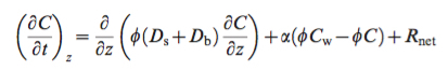
this is what Sir Isaac Newton and Gottfried Wilhelm (von) Leibniz – his counterpart there in the balance – set in motion. this is one form of the tracery of movement.
here is another:
some of the math can be solved. some of it – conceptualized and parameterized (as they say), meaning: thought through and written down over 200 years ago – still can’t.
What does it mean? Start by breaking it down and reading it like the sentence that it is:
How C changes over time is a function of how C changes over space. The change of C over space is a function of what moves it around. What moves it around is a function of physics, biology, geology and chemistry. Physics, biology, geology and chemistry combine in ways that drive change: Biophysics. Biochemistry. Geochemistry. Biogeochemistry. Biophysical chemistry. Geochemical biology.
In the sentence that it is, big D is diffusion. Diffusion is a function of intensity and space. it is movement in all directions at once. In 1 dimension, diffusion is progress along a line. in 2 dimensions it is spokes on a wheel. in 3 dimensions it is radiation. how far? how fast? the answer is a function of difference: the greater the difference, the steeper the gradient; the steeper the gradient, the faster the movement. The temperature of the human body is 98.6 degrees. put your body-temperature hand in ice water and it will get cold fast. put your body-temperature hand in cool water and it will get cold slow. the speed at which your hand gets cold is a function of the difference in temperature between your hand and the environment. a difference is ‘delta’. Big delta, fast speed. Small delta, slow speed. But delta none the less. how deep? how long? it’ll take a while, but if you don’t keep moving, you can still get hypothermia in the Tropics.
In the sentence that it is, R stands for ‘reaction’. It is a placeholder. It is the general term that, once sprung like a jack-in-the-box, contains everything that describes the dynamics of chemical change: gain or loss? absolute or relative? gross or net? What is the difference? Say – for whatever reason – I hand over one donut every minute. Say at the same time, you hand half a donut back. The gross rate at which I hand over donuts is one per minute. The net rate at which I lose donutage is exactly half that. If you’re thinking about environmental change, absolutes aren’t always more important than relatives: sometimes I care about how many donuts are in my stack; sometimes I only need to make sure I don’t go hungry. R(eaction) is driven by chemistry and is controlled by any number of processes in the environment: sunlight, bacteria, temperature, time. Remember, this isn’t about movement – this is about structural change. So, in the sentence that it is: if reaction is a function of chemical structure – meaning chemical A is built from a different arrangement of rings, links and nodes than chemical B – and if chemical structure is sensitive to light, life, heat and/or the ticking of the clock, then in the environment in question what we’re likely curious about is whether we can see that chemical structure change. If so, and if in response to that change, the chemical concentration in question is going down (or up, depending), well then, this is reaction kinetics. This is ‘what’s driving and under which control?‘ How far? how fast? If you can identify the control you can decide whether you have a lever: apply more light? encourage different bugs? boost the T? perhaps build a different framework for time? Remember, that you can write the sentence that it is doesn’t mean you have an answer to the math. But it does mean you’ve taken the first step in understanding what the limits are. And when you understand what the limits are, you begin to understand the actual scope of the problem. How deep? How long? Yes and yes.
And C itself? Well, in general, it is concentration. In specific, it is defined however you need it to be for the question at hand.
Level Eleven
The Castle Town and the Catalyst, that’s what it was: the Chisso Corporation and Minamata Bay, Japan. 1956. It was an acetylaldehyde plant and mercuric sulfate was the catalyst. What hadn’t been understood when production had begun was that the reaction of acetylene and water in the presence of mercuric sulfate creates methylmercury as a byproduct. Not all forms of mercury are created equally. And not all exposures are equally hazardous. Exposure to significant concentrations of methylmercury is hazardous, and in the case of Minamata Bay, direct discharge of methylmercury into the environment was a slow motion catastrophe on an industrial scale.
In Minamata Bay, symptoms started first in the cats. The locals called it dancing cat fever. Cats are often smaller than humans, and they commonly ate the fish washed up on the shoreline; in doing so, they ingested what was biologically accumulating (* – see footnote) from the Chisso Corporation discharge. They began behaving strangely with tremors and a muscle weakness that made them appear to dance. What those symptoms represented was acute methylmercury poisoning. When unusual symptoms started appearing in children, they initially included numbness, difficulty in walking and difficulty with fine motor skills. Progressive symptoms including effects on speech, hearing, swallowing and vision. Convulsions could occur. Patients slipped into comas and died. By the time the full range of neurological exposures and effects had been catalogued – both for those living and those who had been exposed in utero – over 2,000 people had been poisoned, an unknown number of them having died specifically from methylmercury toxicity. Litigation against Chisso Corporation and compensatory claims against the Japanese government continue to this day.
One question we can ask is how did this happen? How did this company conduct business in the way it did for as long as it did without a clearer understanding of what was happening while it was happening? And there are many answer here: Cultural naiveté played a role – both about the effects of chemical exposures and the misplaced faith that Chisso Corporation – employing many of the heads of household in town – must certainly be concerned for the town’s wellbeing. The impact of the 2nd World War and the production imperative that allowed the relaxing of already lax environmental controls – most written in those days from either the vantage of efficiency (i.e., polluting the water that a company needs to redraw into circulation as process water is bad business), or ignorance or that combination of classism and racism that permitted the poisoning of the disenfranchised for the greater net good that industry was providing for all – played a role. As did an incorrect understanding of how estuaries function and the extent to which what is discharged is actually recycled by the tides until the majority of whatever it is settles to the bottom rather than flushing out to sea. And, ultimately here, the low cost and ready availability of mercury as an industrial catalyst also played a role – in the case of Minamata Bay, the concentration of inefficiently recovered (i.e., waste) mercury in the sediment adjacent to the factory discharge reaching 2 parts per thousand, a concentration that could be (and later was) excavated and reclaimed.
And maybe the questions in your head never cease in that endless loop of how and why, but as a mentor of mine once said – you just gotta full on in and go with what interests you. And so it was a different chemical – in this case, it was polychlorinated biphenyls (PCBs) that were discharged – and a different location and industry – in this case, the harbor in New Bedford, MA and the former Aerovox Capacitor Company. But it was the same story – WWII and the rush for production and that blind eye toward whatever basic process regulations might have been in place to even minimally protect human health and the environment – and the impact was the same: once the genie is out of the bottle, there is no easy way to make contaminated places clean again. And in this field that is environmental engineering, the only thing to do about all that mess we witness is to pick up whatever version of a pencil makes your brain warm all smooth into gear and hum and start cranking on the math.
***
* Regarding biological accumulation – or bioaccumulation – or, more technically in this case, biomagnification – of methylmercury, we are all exposed to methylmercury in low concentrations, principally by eating fish and particularly those fish that are long-lived and high on the food chain – think tuna, swordfish and shark – as examples. In the body, methylmercury is somewhat more fat soluble and protein binding than you’d expect for a metal, the methyl group (CH3 -) providing a key to those cells where we store fat, and mercury itself binding well to certain and specific proteins. For these reasons, we – as well as all other organisms – tend to hold on to methylmercury longer than we hold onto other forms of mercury, and because methylmercury is only very slowly excreted from the body, the higher on the food chain you eat, the greater the percentage of the total mercury burden in the organism you’re eating is as methylmercury. For a mussel, filtering sediment and ocean water – some of both of which may have been contaminated by mercury discharge – somewhere around 10% of the total mercury burden in the tissue of that mussel is in the form of methylmercury. But food chain transfer of methylmercury functions like a ratchet – for every trophic level you increase – from the mussel to whatever eats the mussel to whatever eats whatever’s eaten the mussel – both the total concentration of mercury and the percentage of that total that’s in the form of methylmercury – also increase. For a long food chain – one that click by click of the ratchet reaches all the way from mussels to top consumers- tuna, swordfish, shark and, of course, us – while the absolute concentration of mercury in the tissue of that tuna is certainly problematic, what is even more so is that the percentage of that total that is methylated – that is measurable as methylmercury – reaches nearly 100%. For the majority of top trophic level consumers, the major exposure route for mercury these days is through what we eat. From a human health perspective, it is the neurotoxicity of methylmercury that is the greatest concern.
If you’d like to read a completely nerd-to-the-wall discussion of methylation dynamics – that is, how the methylation of inorganic mercury happens in the environment – here is a link: Merritt and Amirbahman_2009. Process understanding in the field has refined somewhat in the past 8 years, and those were, of course, only our opinions, but it is a good place to start. Give a shout, as always, if you have questions.